Back in 1997, the BBC realised that it was responsible for hundreds of very different looking logos, ranging from broadcast channels to corporate services.
As well as being very expensive, the other big negative is that they were so varied in appearance, they didn’t look as though they belonged to the same organisation. They were effectively diluting the BBC brand.
The work done by the Lambie-Nairn agency resulted in a standardisation of the logos – using a combination of the BBC logo, and the department/service name in Gill Sans. This logo would sit alongside a “personality” element – such as the BBC One balloon, or BBC Two’s ‘2’.
Unfortunately, the BBC now seems to be gradually falling into the same trap again, with new logos appearing on a regular basis, and any sense of standardisation all but a distant memory. Different BBC departments seem to be making the call on logo design, rather than this important function being controlled centrally, by branding/design experts, who know what they’re doing.
A prime example of this is the branding for BBC local radio stations and associated regional social media sites. Although there has been some effort to clean up and standardise the branding of these services in recent times, there are still quite a few variations out there.
Individual regions seem to have the autonomy to break ranks regarding a fundamental element – the naming convention for the service. Although most regions do follow the ‘BBC Radio <Place Name>’ format, some don’t – examples: BBC Essex, BBC CWR and BBC Hereford & Worcester.
As some of our readers have pointed out, the “BBC Essex” situation is due to a conflict with commercial rivals – in the past and currently (Essex Radio and Radio Essex respectively). Some would say the BBC station name is still sufficiently similar to the commercial channel to cause confusion.
We received some feedback on this from one of our readers, Robert Williams: “I find it baffling why, when free to pick almost any name they fancy, the owners of Radio Essex have invited confusion by choosing to use a name that makes it sound like a BBC Local Radio station, just because the name happened to be available. For example, though it was eventually corrected, for some time the Radio Times listed Radio Essex’s Chelmsford frequency under BBC Essex.”
Omitting the word ‘Radio’ from the station name not only breaks the branding consistency, but also leaves the stations sounding more like one of the BBC’s general region titles. Surely the ‘BBC Radio’ brand element ought to be mandatory?
It doesn’t help the cause though when a high-profile project such as BBC Sounds makes a half-hearted attempt at standardisation. The splash pages ought to have offered an opportunity to display the BBC Radio channel logos in a standardised, professional format. To a large extent, it does that, yes. But, on closer inspection, the logos are riddled with imperfections, inconsistencies and inaccuracies.


General issues:
- For the UK-wide, Northern Ireland, Scotland and Wales networks – the ‘RADIO’ text does not fit neatly under the BBC blocks. It mostly extends slightly beyond the BBC blocks. The vertical positioning of the ‘RADIO’ text relative to the BBC blocks also seems to vary.
- For the English regional stations, there are considerable variations in font size. In fact, it almost seems that no two logos have the same font size.
- Staying with the English local stations: some have the text beneath the BBC blocks, and others have it alongside. The gap between ‘RADIO’ and the place name varies, and is very tight in some cases.
Additional issues with specific items:
- BBC Radio 1 Xtra: the ‘RADIO’ text extends more noticeably beyond the width of the BBC blocks than in most of the logos.
- BBC Radio 2: the ‘RADIO’ text is slightly less than the width of the BBC blocks.
- BBC Radio Asian Network: the ‘network’ text is larger and positioned slightly lower than ‘asian’.
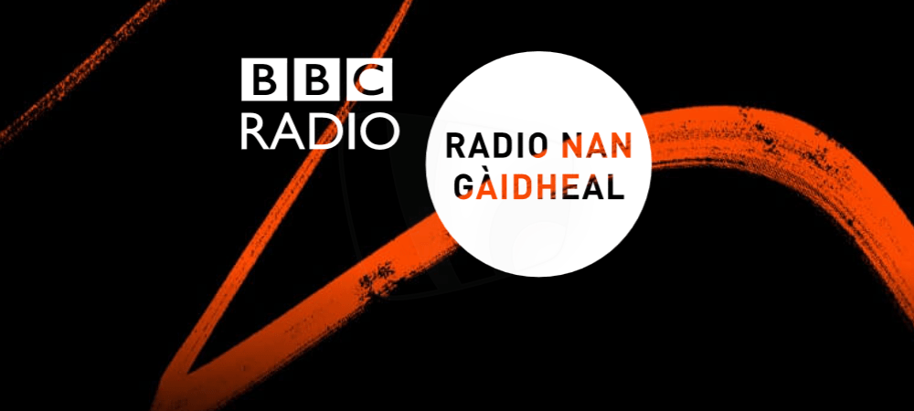
- BBC Radio Nan Gaidheal/Wales/Cymru/Cymru 2: the overall logo features the word ‘Radio’ twice.
- BBC Coventry & Warwickshire: actually branded on air as BBC CWR. Either way, still out of sync with the general naming convention for BBC radio stations.
- BBC Radio Guernsey: different font weight for ‘RADIO’ and ‘GUERNSEY’.
- BBC London 94.9: ‘LONDON’ seems to be Gill Sans Bold, with ‘94,9’ in Gill Sans Heavy. This is also not the official title of the station.
- CBeebies Radio: the ‘O’ of ‘RADIO’ is positioned oddly and is a slightly heavier weight than the other letters.
- BBC Newcastle/BBC Somerset/BBC Surrey/BBC Sussex/BBC Tees/BBC Wiltshire: the word ‘Radio’ is missing for some reason – but it’s there in the corresponding purple logo on the player pages/social media (more on the purple logos shortly). One of our readers, Robert Williams, adds: “The word ‘Radio’ has in fact recently been reintroduced to station names where possible (Tees, Newcastle, Wiltshire, Surrey, Sussex, Somerset and WM) as part of the rollout of the new jingle package”.
- BBC WM 95.6: is referred to on air as “BBC Radio WM” – but ‘Radio’ is missing from the splash logo and purple logo. Robert Williams confirms for us that “95.6” is no longer included in the official station name.
It rather gives the impression the logos were hurriedly pulled together, with a lack of attention to detail.


The main BBC Sounds banner uses the coloured circle element of the various logos to identify the stations, which is fair enough. No big issues here. Though a general comment: circular logos are never generally a great idea – it can be difficult to make the content look correctly positioned/centred. An example of this is the ‘2’ in the BBC Radio 2 logo, which just never seems to look quite right.
We have spotted an unfortunate problem with the BBC Radio Ulster and BBC Radio Foyle logos. In an effort to distinguish between the two stations, the colour scheme is switched – resulting in a white ‘F’ for BBC Radio Foyle, which doesn’t work well for the portion of the ‘F’ that sits over a white background!
But on the station player pages, BBC Sounds resorts to a purple logo image for BBC English local radio stations – with the station name in Gill Sans Regular, rather than Bold (as it is on the splash pages). This image is only displayed when a programme-specific image is not available. A number of the stations that didn’t include the word ‘Radio’ in their splash logo do have it in the purple logo.
This purple logo was rolled out to local radio social media sites – with mixed results. Some stations seem to have opted not to use it. That said, generally, the branding on social media is in a much better place than it was in the not too distant past.
Here’s how things look on Twitter:


Although the majority of English local radio stations have implemented the purple logos, some – BBC Radio Bristol, BBC Radio Devon, BBC Radio Gloucestershire, BBC Radio Lancashire, BBC Radio London, BBC Radio Solent, BBC Radio Stoke – have not. BBC Radio Gloucestershire has even mocked up their own BBC logo, using the wrong font! Very professional.
Some have used Gill Sans Bold rather than Regular. BBC Radio Manchester and BBC Radio Sheffield have gone with the BBC Reith font – and realistically, the whole BBC Radio network should have adopted Reith by this stage.
And then, as one reader spotted, even Facebook and Twitter don’t carry consistent logos:


That covers the online branding. But what of the branding in BBC offices and studios, as well as merchandise?
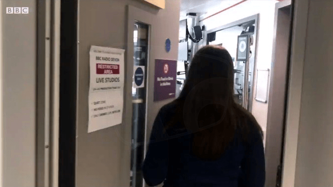
Well, if BBC Radio Devon is anything to go by, the story is a lot worse. An incredible mishmash of branding here. Look at this little collection, all taken from the same video available on their Facebook page.


We’ve seen other examples, and will feature some of them here in the coming weeks. If you spot any other examples of non-standard BBC Radio branding, drop us a line via our Contact page (anonymously or otherwise) and we’ll be happy to include them here.
Standardised, consistent branding is the correct path and ultimate control of branding/design must sit with a centralised group. But it is important that the end product is completed to a professional standard. That sounds like such an obvious thing. But a design that is technically flawed will attract legitimate criticism very quickly and confidence will suffer.
The client must feel they have some input into the design process too and that their voice is being heard. This can be tough for the designers – particularly where there are large numbers of stakeholders, with very different ideas about how their product/service should be represented. But without this sense of partnership, internal departments/services represented by these logos will resort to taking things into their own hands, if they have the power to do so.
Acknowledgements
PICTURED: BBC Radio channel logos. COPYRIGHT: BBC.


It’s annoying when people write articles without research. Changing the name of some stations is not possible. For example, when BBC Essex started it was not allowed to include the word “Radio” in its title. The Independent station Essex Radio stopped it, because so many people called Essex Radio “Radio Essex” it was thought that the standard naming of “BBC Radio Essex” would be too confusing.
Thanks for the clarification on this. We have updated the article accordingly.
BBC Hereford and Worcester has never had “Radio” in its name since it launched in 1989. I guess they thought the name was long enough.
The word ‘Radio’ has in fact recently been reintroduced to station names where possible (Tees, Newcastle, Wiltshire, Surrey, Sussex, Somerset and WM) as part of the rollout of the new jingle package, while BBC Coventry and Warwickshire has reverted to CWR. However the BBC is still prevented from using the Radio Essex name as there is still a commercial station using that name (unrelated to the original Essex Radio).
The main problem with the splash screens is that they don’t take into account any of these recent name changes, or even a not-so-recent name change – BBC London 94.9 hasn’t actually been called that for five years, having reverted to the BBC Radio London name in 2015.
In response to the updated article, I should mention that WM have dropped the ‘95.6’ from their name – they are now known as BBC Radio WM.
I find it baffling why, when free to pick almost any name they fancy, the owners of Radio Essex have invited confusion by choosing to use a name that makes it sound like a BBC Local Radio station, just because the name happened to be available. For example, though it was eventually corrected, for some time the Radio Times made the error of listIng Radio Essex’s Chelmsford frequency under BBC Essex.
Thanks for the additional information Robert. We’ve updated the article to reflect the confirmations you’ve supplied.
In the BBC Sounds logos, Wales, Cymru, Cymru 2 and Nan Gaidheal all have the BBC Radio logos AND the word ‘Radio’ in the station/location name. The Radio Wales/Cymru/Cymru 2 text is all lowercase, whereas the rest of the nations and regions are all uppercase (except Scotland, which is capitalised). BBC RADIO radio wales. Madness!!